Hate Powerpoint? So does the research. Here's what to do instead

GET THE #1 EMAIL FOR EXECUTIVES
Subscribe to get the weekly email newsletter loved by 1000+ executives. It's FREE!

From Tufte to Bezos: The Death of PowerPoint and Rise of Narrative
In 2003, Edward Tufte, the renowned information design expert, published a scathing critique of PowerPoint titled "The Cognitive Style of PowerPoint."
Download the PDFThis essay would go on to spark a revolution in how we think about presentations, ultimately influencing one of the world's most successful CEOs, Jeff Bezos, to ban PowerPoint at Amazon.

Tufte's Critique
In Tufte's critique of PowerPoint from The Cognitive Style of PowerPoint, several key points stand out:
Critique 1
Reduction of Analytical Quality
Tufte argues that PowerPoint's default templates weaken both verbal and spatial reasoning, and often corrupt statistical analysis.
He believes the software promotes oversimplified presentations that lack depth and analytical rigor.
I personally found this very interesting, that the physical design of the software could have such a profound impact on the quality of thought!
Critique 2
Presenter-Oriented, Not Audience-Oriented
PowerPoint is designed to serve the presenter, helping them organise thoughts and reduce jitters.
However, it neglects the audience’s needs for clarity and in-depth information.
Tufte points out that PowerPoint presentations are often filled with "chartjunk," excessive decoration that detracts from the content.
Critique 3
Extremely Low Resolution
The low resolution of PowerPoint slides, both visually and in terms of content, forces information into fragments.
This prevents audiences from effectively analysing relationships between ideas or making complex comparisons. Tufte argues that serious analysis is better suited for high-resolution formats like written reports or detailed handouts.
Critique 4
Misleading Bullet Points
Tufte criticises PowerPoint’s over-reliance on bullet points, which can obscure the causal relationships between ideas and lead to shallow thinking.
He compares it to programming code, where the structure and hierarchy become more important than the content itself.
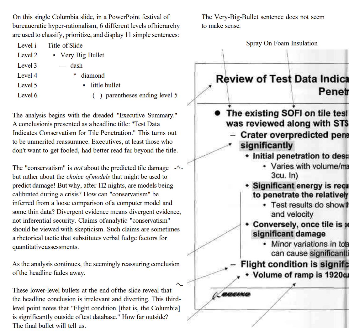
He uses an intersting slide to prove his point, that from the Columbia space shuttle disaster, where the bullet points obscured the critical information.

Screenshot showing Tufte's critique of bullet points in PowerPoint.
Critique 5
Hierarchical Filtering of Information
He discusses how PowerPoint’s structure can distort the flow of information, especially in hierarchical organizations like NASA, where key details were lost as information was passed upwards through bullet-point slides.
He cites the Columbia space shuttle disaster as an example where PowerPoint's cognitive style contributed to communication breakdown.
Critique 6
Preference for Paper Handouts
Tufte advocates replacing PowerPoint slides with high-resolution paper handouts, which allow viewers to see all the relevant information simultaneously. This promotes better understanding and critical thinking, as audiences can compare, analyze, and synthesize data more effectively than with slides.
These points encapsulate his argument that PowerPoint often reduces the quality of thought and communication, especially in settings that require detailed, nuanced analysis.
Tufte famously said, "PowerPoint is evil," arguing that it degraded the quality of thought in organisations.
The Amazon Revolution
Jeff Bezos, always on the lookout for ways to improve decision-making at Amazon, took Tufte's critique to heart.
In 2004, he banned PowerPoint presentations from executive meetings at Amazon. Instead, he required executives to submit six-page narratives.
Why? Bezos believed that:
- Writing full narratives forces clearer thinking
- Reading is faster than listening to a presentation
- Narratives allow for more nuanced, contextual understanding
- This format encourages more thoughtful discussion
The result? Amazon's meetings became more productive, decisions more informed, and communication clearer.
The Ripple Effect
Amazon's success with this approach has influenced other tech companies. LinkedIn and Netflix have experimented with similar narrative-based approaches. Even Microsoft, the maker of PowerPoint, has started to rethink presentation culture.
When to Apply the No-PowerPoint Rule
Not every meeting or organisation needs to ban PowerPoint entirely.
Here's a checklist to help you decide when to use narratives instead of slides:
- Complex Decision-Making: If the topic requires deep understanding and careful consideration, use a narrative.
- Strategic Planning: Long-term planning benefits from the nuance and context a narrative provides.
- Product Development: Detailed product specs are better communicated in writing.
- Financial Reviews: In-depth financial analysis is often better suited to a written format.
- Cross-functional Projects: When multiple teams need to align, a comprehensive document can ensure everyone is on the same page.
- High-Stakes Presentations: When the outcome is crucial, invest the time in a well-crafted narrative.
- Executive Meetings: Following Amazon's lead, consider narratives for top-level meetings.
- Remote Teams: Asynchronous work benefits from detailed written communication.
Conclusion
So if you find yourself drowning in bullet points and struggling to communicate complex ideas, consider the narrative approach.
Remember, the goal isn't to ban all visual aids, but to ensure that our communication tools enhance rather than hinder our thinking. As Tufte himself said, "The minimum we should hope for with any display technology is that it should do no harm."


