Trying to Find The Best Landing Page Website Formula

GET THE #1 EMAIL FOR EXECUTIVES
Subscribe to get the weekly email newsletter loved by 1000+ executives. It's FREE!
Trying to Find the Best Landing Page
Alright so here's the deal. I've made a few websites in my time. Like our one at Cub Digital but I want to figure out what exactly the best website landing page framework is.
Goals
-
Figure out if there has been any research done on this subject
-
See how this could be applied to my company.
-
Experiment with some landing page concepts and see how they go.
-
Implement Posthog on the system and then run an experiment and test the results.
-
Another Goal is to see how quickly can you become an expert on a subject just by going deep and reading about it.
Inspiration

There was a tweet I saw shared about how at Youtube it was transformed all by the work of one UX researcher just going extremely deep and basically putting in the hard work. That inspired me to do the same here. From the work they did I was struck by the fact that it was quite obvious on the surface of it, but then how many things in life or in business are just sitting there in plain sight just waiting to be discovered?
Why Am I doing this?
- I am doing an outreach campaign and I am not 100% sure if the website I have is the best at converting people. I want to do an experiment to see if we can increase that.
- I thought it would be cool to systematically and methodically review the different parts about websites and then do a series on all of the different learnings from that process.
- I am in technology and advise people on their websites annd so it would be great to actually have done deep dive research on the subject to act as an expert through this.
- I also feel like in an age of algorithims I never have to work for anything anymore. I never have to try things. I'm just being served up things. I never have to actually look at a bunch of things, try them and implement them. I just get served up optimised content and then basically swan on to the next thing.
Approach
So we are going to need a framework for tackling this problem. I think I'm going to spend some time on the following
- Scientific Research and Case Studies
- Chat GPT?
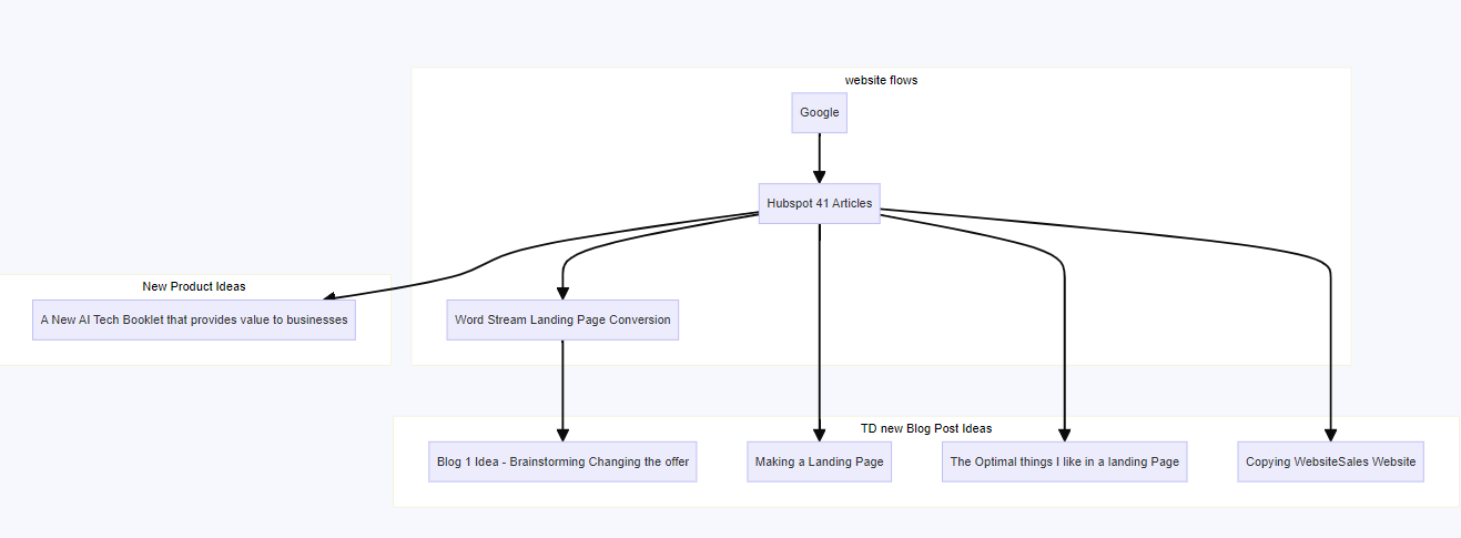
Mermaid Chart
I am going to make a flowchart as I go of the approach I took and then all of the sub links. I am just interested to see if I follow a linear thread or how this ends up. Plus then it is also a chance to learn how Mermaid works.
I am looking for probably a mixture of ideas.
- Has there been any studies done?
- Has there been people that have done A/B tests that have actually shown significant increases.
Step 1 - Googling it
Alright 9 articles that cover the full spectrem of what we want. Man Google isn't what it used to be aye. Gone are the days of 10 links on a page, now you have to scroll past hundreds of keyword filled articles to find something you kind of maybe want? That's also after you wade through the entire top part of the page which is just sponsored posts.
What we have learned from the websites
- Website 1 - Hubspot
41 Landing Page Design Examples to Inspire Your Own in 2024
Alright Hubspot is first. Let's see what we learn
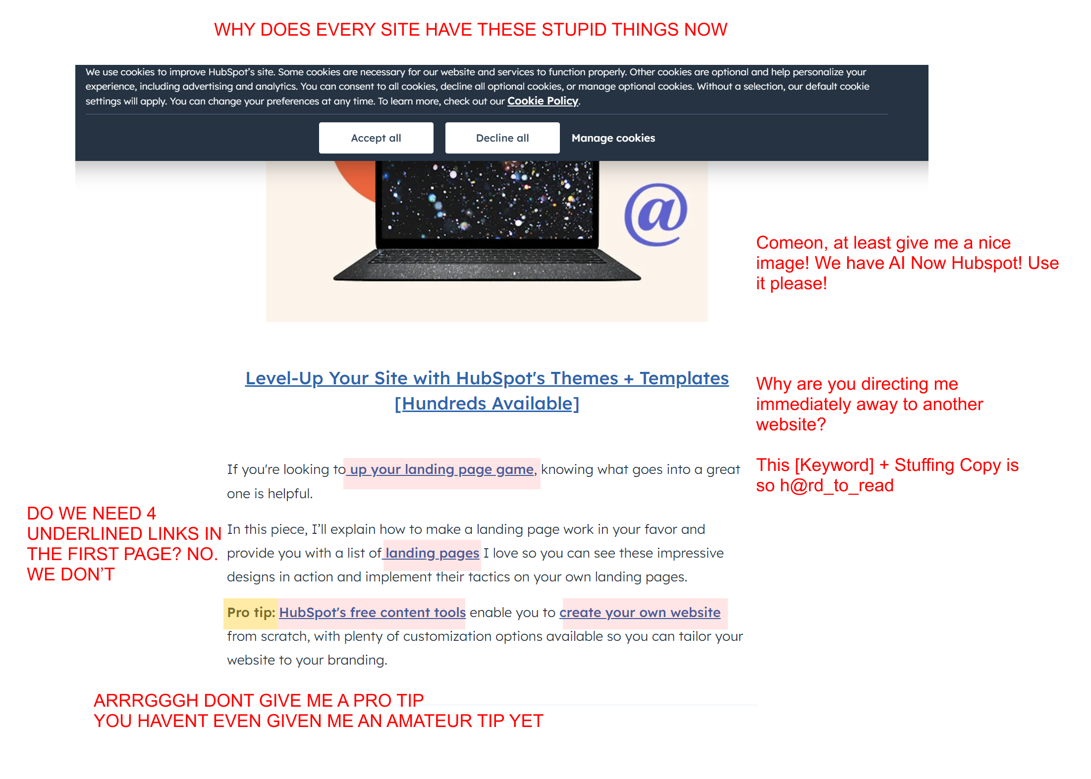
Timeout Timeout Timeout. WTF is up with websites in 2024. This is literally unreadable and extremely frustrating. From the banner ad at the top. Anyway, we are looking for gold so let's continue.
Okay at least they started straight with the good stuff.
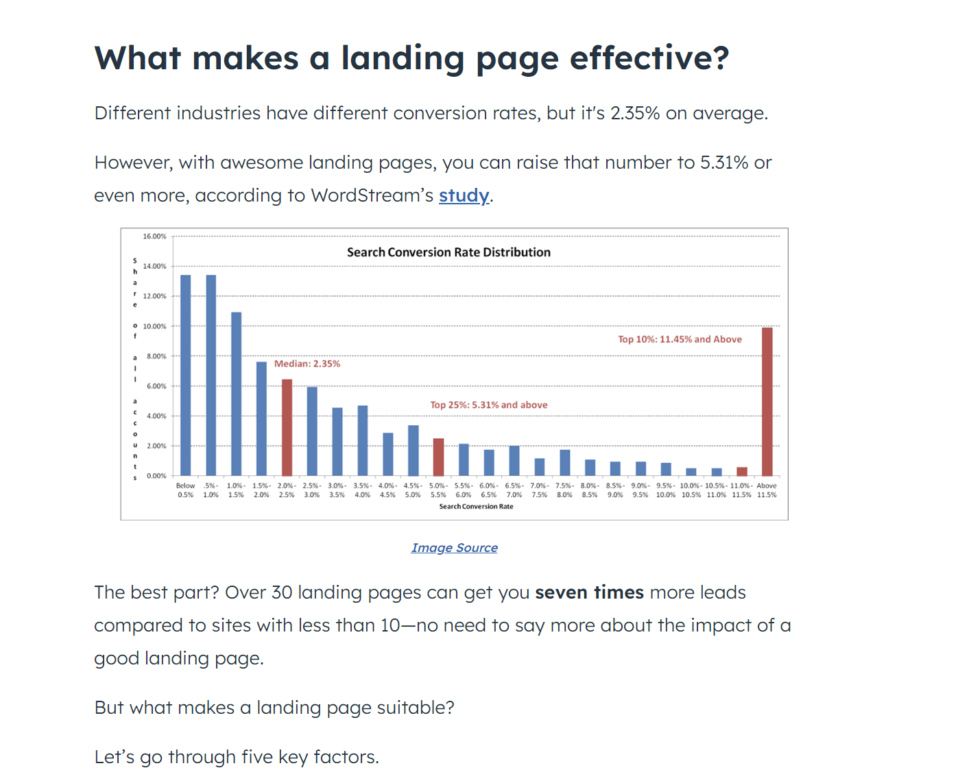
- Alright let's remember that 2.35% is an average conversion rate.
- A good landing page raises that to 5.1% According to this study from Wordstream
Hmmm the only thing is... That study referenced is from 2014. Now my spidey senses are tingling because the internet is a different beast out there now than it was in 2014. It's been 10 years. Surely there is more up to date research? Hmmmm, If everything Hubspot has said has been based on that, should we actually go and find the research first? Or do we do Hubspot first and then just compare everything at the end? Let's continue and make a note to proceed with studies later?
This has immedieately made me consider what my own conversion page on my website is.
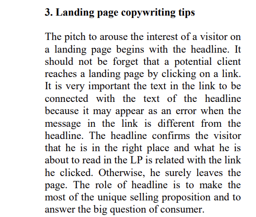
Alright that's an interest point so we need to make sure the heading is important.
KEY LEARNING MAKE THE HEADING AWESOME
Great this is actually what I am after in this next part. I want detailed templates and guides of frameworks that will be helpful.
Alright I looked at all 41 websites that were on the Hubspot site and phew! Has anyone ever done that before? Probably not. They were abssolutely terrible, like just beyond bad and I can't believe that they even published this.
Anyway through the muck they at least provided an absolutely legendary site which did make the whole exercise worth it. There were two really good websites on there
WebProfits I liked this site for its clarity, the way it showcases outcomes. I could imagine if you were the target market for this, this would be an extremely effective website.
Wise I like how scanable and nice this is.
- Key takeaways from reviewing the 41 websites
- I love big bold fonts
- I love sites you can scan in 5 seconds
- The only 2 sites that made me stop were WebProfits and Wise. They both have big text. Webprofits is awesome and I loved how they showcased tangible results. I want to copy this formula and then give it a go on my own website.
- Through this exercise, I do think it was worth it to actually find the Webprofits site.
- Maybe we need to split this up into multiple chapters as I am only 1 website in and have already learned so much from it all. I made a mermaid chart that I will share now with all of the ideas that I had
Website 1a - The Study on Landing Pages
Ok immediately I like this person and agree absolutely with this sentiment.
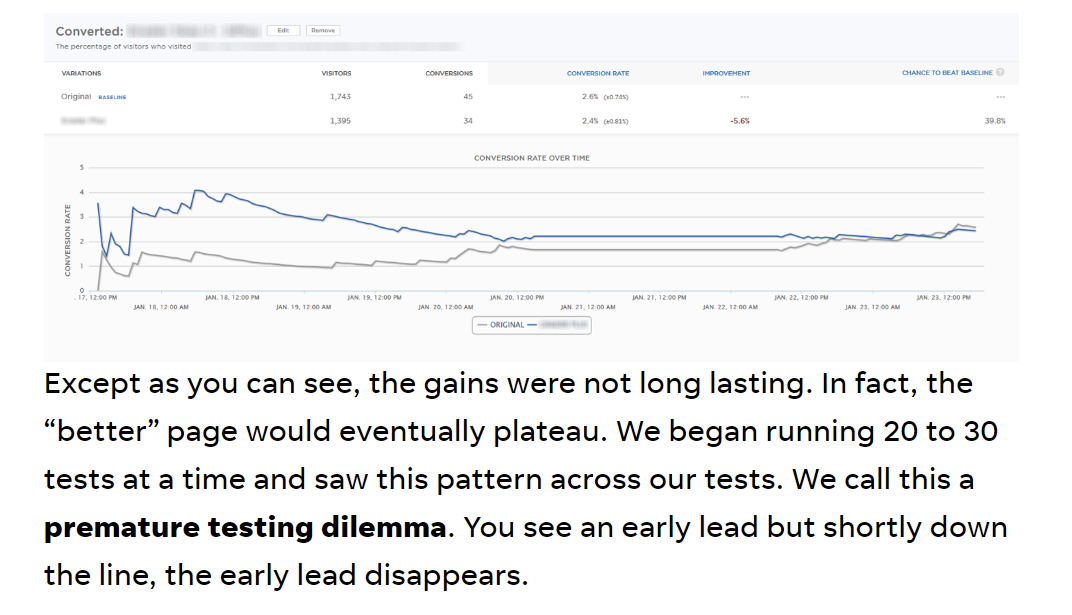
Thats interestingm, so diddly little things don't make a big difference. Do we need to back this up with more evidence? It seems to throw out AB testing, but I know its an extremely big part of Netflix and Airbnb.
NOTE TO RESEARCH AB TESTING
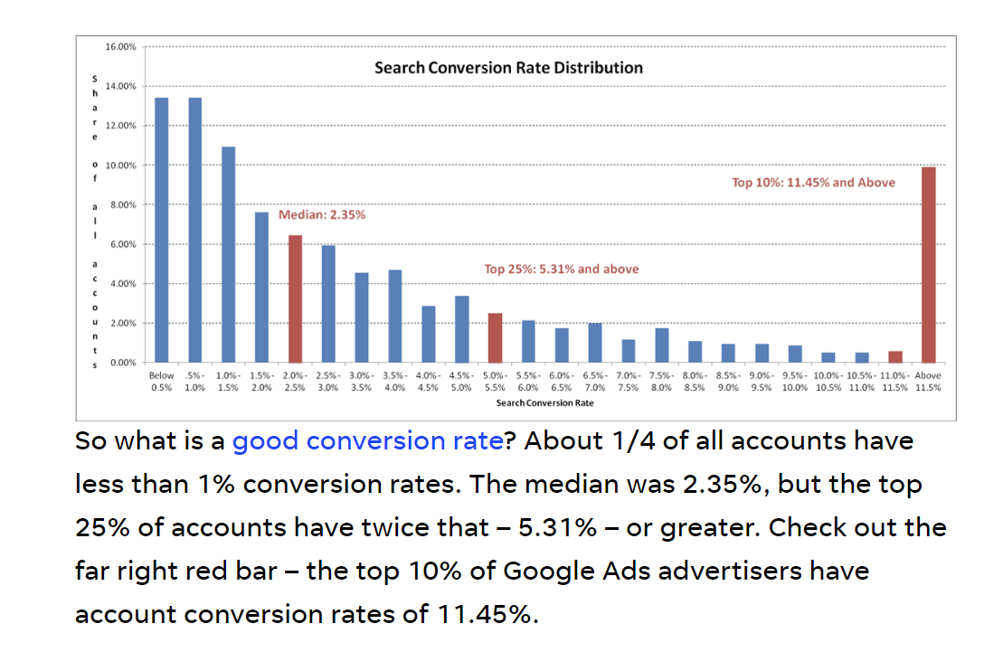
Ok that graph is interesting. Showing that the majority of people are at 2.35% but then some people are at 11%. So this is clearly a system that you can game and you can win. Let's mark this as a key learning
THE ABOVE IS A KEY LEARNING - AT THE END OF THIS POST I WANT TO SUMMARISE NICELY ALL OF MY KEY LEARNINGS
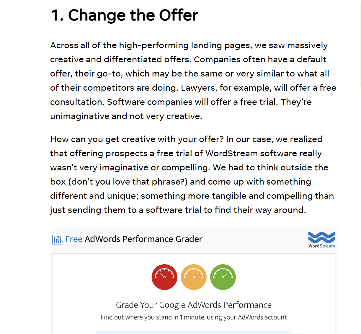
Alright this is great advice and already seems like the idea for another blog article idea. Rather than doing what everyone else does you need to change your perspective on it. So I'd love to do a brainstorm session on that for what I am doing.
NEW BLOG ARTICLE IDEA - CHANGE THE OFFER
KEY LEARNING OR OFFERING TO CLIENTS - WE WILL HELP YOU COME UP WITH NEW OFFERS
ALREADY GETTING A BIT OF A FLOW HERE
Here is an interesting part of it
-- make this markdown quote
"On average, you should be testing four unique landing pages – with varying offers, flow and messaging – to find that one awesome landing page. If you want to find a unicorn landing page – that top 10% page that sees your conversions reaching 3-5x the average – you need to test at least ten landing pages."
KEY LEARING - WE NEED TO BE BRAINSTORMING 4 IDEAS PER PAGE\
Website 2 - Impression Landing Page Design
I really like the definition they provide here of a landing page
Landing pages should:
- Serve a single purpose
- Have a clear goal
- Be created with a specific audience in mind
KEY LEARING A LANDING PAGE SHOULD SERVE A SINGLE PURPOSE
They talk about Different types of landing pages based on search intent
- Informational
This is to provid information.
- Navigational
This is to help navigate users to various pages. A lot of home pages are navigational pages. Apparently the user already knows what they are after when they click on the page, which is interesting as I am not sure if a lot of users actually know what they want.
- Commercial
Right down the funnel when you want to buy something. Product page.
- Transactional
A page designed to help the transaction.
Analysing the above
While the above sounds smart and interesting, I just don't think it really sheds and new knowledge or provides any real value? None of those page types are that revealing and if anything, it just seemed quite rush. I think there is multiple types of queries that peope have and that there are far more types of pages than just the above. Or put this is another way, none of the above information really drives us any closer to crafting the optimal landing page.
Okay the above are interesting, however, we also need to include the fact that we are mainly dealing with a mmobile audience.
The article then talked about pyschology
The next thing they talk about is the pyschology of landing page designss
- Attention
- Memory
- Anxiety
- Loss aversion & scarcity
- Reciprocity
- Trust
- Motivation
But it basically just listed arbitrary emotions without diving deep into anything.
Website 3 - UX Planet How to Design the best Landind Page
This is the website for UX Planet
Straight off the gate they say that you only have 8 seconds which seems like a key learning
KEY LEARNING YOU ONLY HAVE 8 SECONDS TO GET PEOPLES ATTENTION
- the only goal of a landing page they argue is to convert visitors to leads
- Clear message and minimal distractions
“Landing pages with fewer than 100 words are 50% more successful than pages with over 500 words”
Analysis of 18,000 Unbounce Websites
“Get rid of half the words on each page, then get rid of half of what’s left”.
"It’s better to keep the design familiar to users, it’s better to refrain from trying to reinvent the wheel."
Summary of that website
It was good short and sweet and put me into the book Don't make me think
Website 4 - LinkedIn Article by Pamela Salon
Golden Ratio

I mean just because we have a rule of thirds here or a golden ratio doesn't mean the landing page is good at all....
The interesting thing I learned about this is Jakob's Law
Jakob’s Law
The law was coined by Jakob Nielsen of the Nielsen Norman Group, a well-known UX research institute. People spend a lot of their time on other websites and as a result they are already used to specific design patterns. So basically don't reinvent the wheel and just use these patterns.
Hick’s Law
According to Hick’s Law, the more choices users have, the longer it would take for them to reach a final decision.
Conclusion on this article
I think this is typically of the modern internet, just a bunch of quick half thought ideas linked to one example. Nothing really of subsstance here. Just different laws without any real research or backing showing that they are definitely better.
Website 5 - GoSquared
55 Examples and there was 0 information here that was useful or added anything. Just seemed like a Chat GPT article.
I'm getting the vibe and sense that little deep work has actually been done or at least on the front page of Google. It's just people that are good at SEO getting to the top rather than proper scientific studies.
Website 6 - CXL - How To Build High Converting Landing Page
- Never send traffic from an ad to your homepage it has to be to a tailored page.
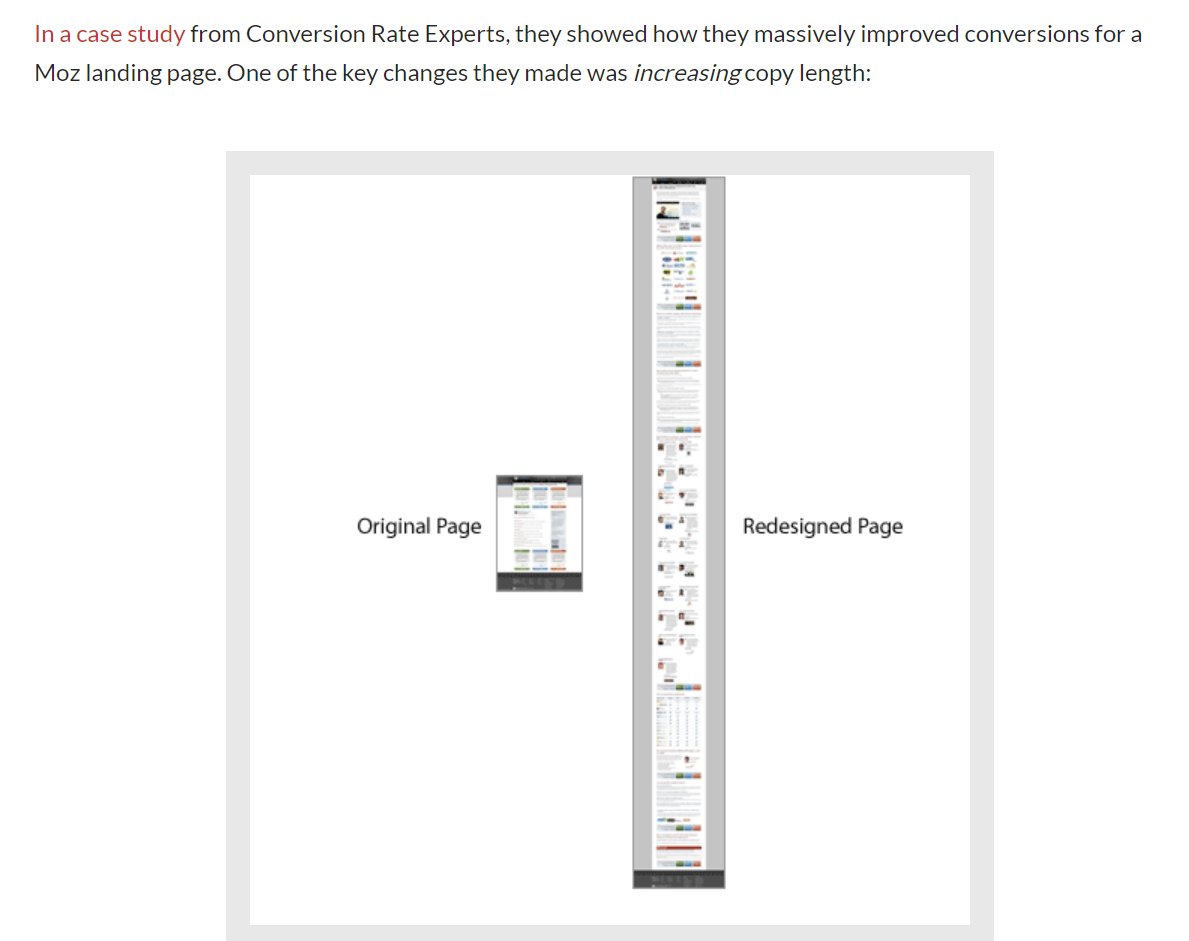
They reference a Moz Case Study
In this study they increased the copy length.
Website 6a - Conversion Rate Experts Moz Case Study
This company apparently increased sales 52%. However, I am skeptical as the landing page looks absolutely spammy and terrible and this just seems like yeah some people bought things because you have a lot of traffic.
But anyway, there was some interesting points with this
Key Learnings that I found helpful
-
We infused the headline with curiosity rather than overt “buy me” language.
-
Another interesting thing they did is time the sales presentation in real life of how long a customer took to buy Moz and then they made it so that they would match that on the website which I think is clever and then they also used Amazon and Apple as examples.
-
Sometimes you will take a feature of yourself for granted that your customers actually love. So make sure that you actually demonstrate that on the page.
-
They had this concept of a risk bar and so they lowered it to make sure that their customers had no risk.
-
Compile a list of objections and, for each one, create a counter-objection. When visitors don’t buy, it’s for a reason—perhaps the price is too high, the product description is too vague, the site contains insufficient proof to back up the claims, or any of a hundred other objections. Take the most-common objections and methodically address each one through testimonials, case histories, examples, screenshots, and any other proof you can muster.
-
Remember that when you sell face to face, you need to answer only one person’s objections. When you sell on the web, you must anticipate and address all the major objections, so don’t handicap yourself for the sake of some old myth about page length.
I really liked the takeaways from that article it was probably one of the most helpful ones that I have read so far.
KEY LEARNING - Time your sales pitch in real life for how long it is for customers to understand you and then make your website also take that long
Intermission, I want to now put some landing pages to the test based on what I have learned as a consolidation and a check
So here we go, I need to so far if I didn't anymore research, design what a good landing page is. I have digested a lot of information and need to have a case study.
Let's start a new landing page. My business offers technology audits for companies. We come in, we audit what you do and then we help you with your tech stack.
Let's give it a go.
Tubrik Blog Post
A lot of nice pretty landing pages here, probably my favourite of all of them, because basically the site is from a design agency. But a lof the words they use are just so fluffy.
Unbounce - Anatonmy of a Landing Page
Again, a lot of people just quote this is what it is, but it doesn't really give you compelling reasons as to why.
Scientific Research Section
Article 1 - Landing Page Features to Attract customers
Pro tip, I have never really read a whole lot of papers for a subject before, so I am going into this blind. I am going to start with the first one that I found and then go from there.
This is the PDF of the article
Okay instantly, I am sceptical about this article
Here is the quote from the article
A promising trick is to include in a landing page social media sharing buttons, because people might share it with others. [5] Another tip is the split test. This experiment can be done between two landing pages or more to which one gets more traffic. [6]
This sounds even more amateur than the most amateur of blog posts.
Is this seriously what research is like? How can it be so bad? I actually can't believe that this is published?